Hello,
here I submit the Assignment 2 of course Data Management and Visualization by Wesleyan University.
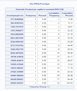
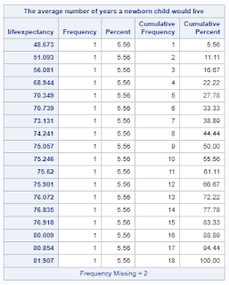
here I take 20 observation to show an output of the code.also in this relationship frequency processes are not useful because every observation has unic value.
Review of references:-
here,
each bubble represents a country,
each color of the bubble represents world regions like,
Red represents Asia;
yellow represents Europe;
green represents America;
Skyblue represents Africa;
each bubble Size represents a population.
this graph shows that the country has an income less than $5000 they have the shortest life expectancy. the country has an income greater than $50000 they have the longest life expectancy.on the same income level there is a huge difference in lifespan.


No comments:
Post a Comment